
COLOUR PSYCHOLOGY IN BRANDING
Share
Imagine walking into a room bathed in deep blue tones. Instantly, you feel a sense of calm, trust, and stability. Now, picture stepping into a space filled with bright red accents. Your heartbeat picks up; there’s energy, urgency, and excitement in the air.
This is the power of colour psychology—a subtle but powerful force that influences how customers perceive brands, often without them even realizing it.
Brands have long harnessed the subconscious influence of colour to shape their messaging, evoke emotions, and even drive consumer behavior. Whether it’s the passionate red of Coca-Cola, the serene blue of Facebook, or the luxurious purple of Cadbury, colours speak a language beyond words. Let’s explore how different colours shape perceptions and how you can use them effectively in branding.
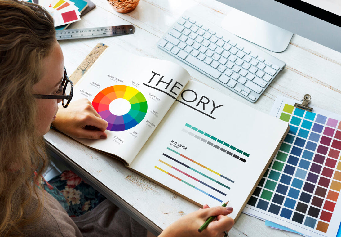
The Science of Colour Psychology
Colour isn’t just about aesthetics; it’s deeply connected to human psychology. Our brains associate different hues with specific emotions and reactions based on both cultural influences and innate biological responses.
For instance, studies have shown that 87% of consumers say colour is a primary reason they buy a particular product. Moreover, colour increases brand recognition by up to 73%. These statistics prove that choosing the right colour palette is more than a design decision—it’s a strategic move that can impact consumer trust, sales, and brand loyalty.
Breaking Down Colours and Their Influence
Red: The Colour of Passion and Urgency
Story: Picture yourself walking through a shopping mall. Your eyes dart to a big, bold red sign screaming “SALE – 50% OFF!” Without thinking, you step closer, drawn by an invisible force. That’s red at work. It grabs attention, creates urgency, and fuels impulsive buying decisions.
Best for: Brands that want to evoke excitement, urgency, or passion. Think Coca-Cola, Netflix, and Red Bull.
Use carefully: Too much red can feel aggressive, so balance it with neutral or softer tones.
Blue: The Colour of Trust and Stability
Story: You’re about to sign up for online banking. One website features a playful yellow background, while another has a professional deep-blue interface. Which one do you trust more with your money? Exactly.
Best for: Finance, healthcare, and tech companies looking to convey reliability. Examples include PayPal, Facebook, and IBM.
Use carefully: While blue builds trust, an overuse can make a brand appear cold or distant.
Yellow: The Colour of Happiness and Optimism
Story: A child’s birthday party is in full swing. Balloons, decorations, and packaging all shine in bright yellow. There’s an undeniable warmth and cheerfulness in the air.
Best for: Brands wanting to express positivity and friendliness, such as McDonald’s, Snapchat, and Ikea.
Use carefully: Yellow can be overwhelming in large doses and hard to read in digital spaces.
Green: The Colour of Growth and Health
Story: A health-conscious shopper scans the grocery aisle. She instinctively reaches for the brand with green packaging, associating it with natural, organic, and eco-friendly qualities.
Best for: Brands tied to nature, sustainability, health, and finance. Think Whole Foods, Starbucks, and Animal Planet.
Use carefully: Certain shades of green can feel too sterile or dull if not balanced well.
Purple: The Colour of Luxury and Creativity
Story: You enter a high-end spa where the lighting, logo, and branding are adorned in rich purple hues. It exudes exclusivity and indulgence.
Best for: Luxury brands, beauty products, and creative industries. Examples include Cadbury, Hallmark, and Twitch.
Use carefully: Too much purple can appear overly extravagant or artificial.
Black: The Colour of Elegance and Authority
Story: A premium watch brand unveils its latest collection. The sleek black packaging, combined with gold lettering, oozes sophistication and high value.
Best for: High-end brands, luxury fashion, and technology companies. Think Chanel, Apple, and Nike.
Use carefully: While black conveys power, it can also come across as unapproachable if not balanced with lighter accents.
White: The Colour of Simplicity and Purity
Story: You walk into an Apple store. The clean, white layout makes every product stand out, emphasizing innovation and clarity.
Best for: Minimalist brands, healthcare, and tech industries. Examples include Apple, Tesla, and Adidas.
Use carefully: Too much white can feel stark and impersonal.
How to Choose the Right Colour for Your Brand
When selecting colours for your brand, consider:
- Your Brand Personality: Are you energetic or calm? Luxurious or affordable? Playful or serious?
- Your Target Audience: Different demographics respond to colours in unique ways. For instance, younger audiences might favor bold, bright colours, while older consumers may prefer muted, classic tones.
- Cultural Associations: Colours have different meanings worldwide. In Western cultures, white symbolizes purity, while in some Asian cultures, it’s associated with mourning.
- Competitive Landscape: Look at what competitors are doing and either align with industry expectations or deliberately stand out.
Final Thoughts: The Art of Colour in Branding
Colour is more than just an aesthetic choice—it’s a powerful tool that influences how customers perceive your brand, feel about it, and ultimately interact with it. The right colour palette can make your brand unforgettable, increase customer trust, and even boost sales.
Next time you design a logo, choose a product colour, or refresh your brand’s visual identity, remember: colours aren’t just colours. They are emotions, stories, and psychology wrapped in a visual experience. Choose wisely, and your brand will leave a lasting impression.