
5 Tips For Memorable Business Cards
Share
A business card is more than just a piece of paper with contact information—it’s a physical extension of your brand, a first impression that lingers long after a handshake.
In a world saturated with digital connections, a well-designed business card can set you apart, leaving a lasting impact on potential clients and partners. But how do you create a card that isn’t just another forgettable piece of paper?
Let’s dive into five powerful design tips, each illustrated with real-world examples, to ensure your business card stands out and works for you.
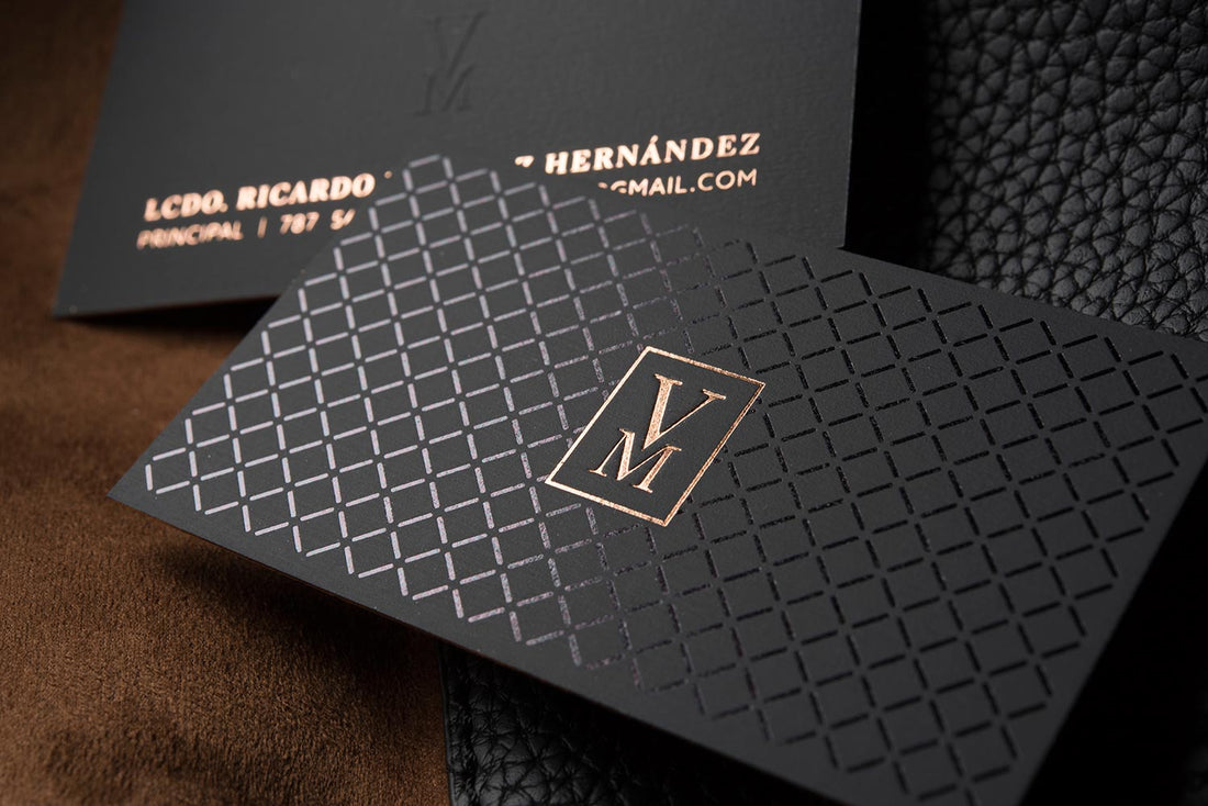
Tip #1: Make a Strong First Impression with Unique Materials
Story: Imagine attending a networking event where you exchange cards with several people. At the end of the night, you shuffle through the stack—most are the same standard cardstock. But one feels different. It’s thicker, textured, maybe even made of metal or wood. Instantly, it stands out. That’s the power of unique materials.
Lesson: The feel of a business card is just as important as its look. Consider options like:
- Thicker cardstock (16pt+ for durability and luxury feel)
- Textured finishes (embossing, debossing, soft-touch coatings)
- Plastic, wood, or metal cards for a high-end, innovative touch
Example: A high-end architect might use a business card made of transparent acrylic, reflecting modernity and precision, while an eco-friendly brand could opt for recycled kraft paper to emphasize sustainability.
Tip #2: Use Bold, Intentional Typography
Story: A startup founder receives two business cards. One has tiny, hard-to-read text crammed with excessive details. The other has a simple, bold name in a clean, elegant font. Guess which one they remember?
Lesson: Typography isn’t just about readability—it conveys personality and confidence. Big, bold fonts create a sense of importance, while script or serif fonts can add elegance or tradition.
Best Practices:
- Use a font hierarchy (company name bold, secondary info smaller)
- Stick to two fonts maximum for a clean, professional look
- Ensure contrast between text and background for readability
Example: A luxury real estate agent might use a bold, elegant serif font with foil stamping for an upscale feel, while a tech startup founder may opt for modern, sans-serif typography to showcase innovation.
Tip #3: Incorporate Clever, Functional Design Elements
Story: A graphic designer hands you a business card. You flip it over, and it transforms into a mini color swatch palette. Not only does it showcase their work, but it also makes the card functional—and impossible to throw away.
Lesson: Business cards can do more than just share contact info—they can be tools, conversation starters, or brand reinforcements.
Creative Ideas:
- A folded business card doubling as a mini portfolio
- A die-cut design shaped like a relevant object (e.g., a camera-shaped card for a photographer)
- A QR code linking to your website or a personalized video message
Example: A fitness trainer might have a business card that folds into a tiny workout cheat sheet, making it both memorable and useful.
Tip #4: Choose Colors That Evoke Emotion & Brand Identity
Story: A potential client pulls out two business cards. One is plain black-and-white; the other bursts with carefully chosen brand colors. Which one do you think feels more engaging?
Lesson: Color psychology plays a huge role in how your business card is perceived. Choose colors that align with your brand’s personality and emotions.
Color Strategies:
- Blue conveys trust and professionalism (great for financial and tech industries)
- Red sparks excitement and urgency (perfect for sales-driven industries)
- Green symbolizes growth and eco-consciousness (ideal for wellness brands)
- Black and gold exude luxury and exclusivity (fantastic for premium brands)
Example: A creative agency might use a bold pop of yellow to show energy and innovation, while a financial consultant could stick with deep blue tones to convey trust.
Tip #5: Keep It Simple, Yet Impactful
Story: A business coach receives a business card so overloaded with information—social media handles, multiple addresses, tiny icons—that it’s hard to focus. On the other hand, another card simply displays a name, title, phone, and website, with a clean layout and lots of white space. The second card gets kept; the first one gets tossed.
Lesson: Less is more. Your business card should have just enough information to spark interest, but not so much that it overwhelms.
What to Include:
✅ Name & Title
✅ Phone & Email
✅ Website (or QR code linking to more details)
✅ Logo & branding elements
What to Avoid:
❌ Cluttered text
❌ Too many social media links (stick to one or two max)
❌ Overly small fonts
Example: A minimalist brand designer might use a simple white card with clean typography, ensuring every detail is purposeful and striking.
Final Thoughts: Business Cards That Make an Impact
Your business card isn’t just a formality—it’s an opportunity. By:
- Using unique materials to stand out
- Choosing typography that commands attention
- Adding functional or interactive design elements
- Leveraging color psychology for emotional impact
- Keeping the design clean and intentional
…you create a business card that isn’t just memorable—it’s unforgettable.
Want to take your business card game to the next level? Let’s design something that turns heads and sparks conversations!